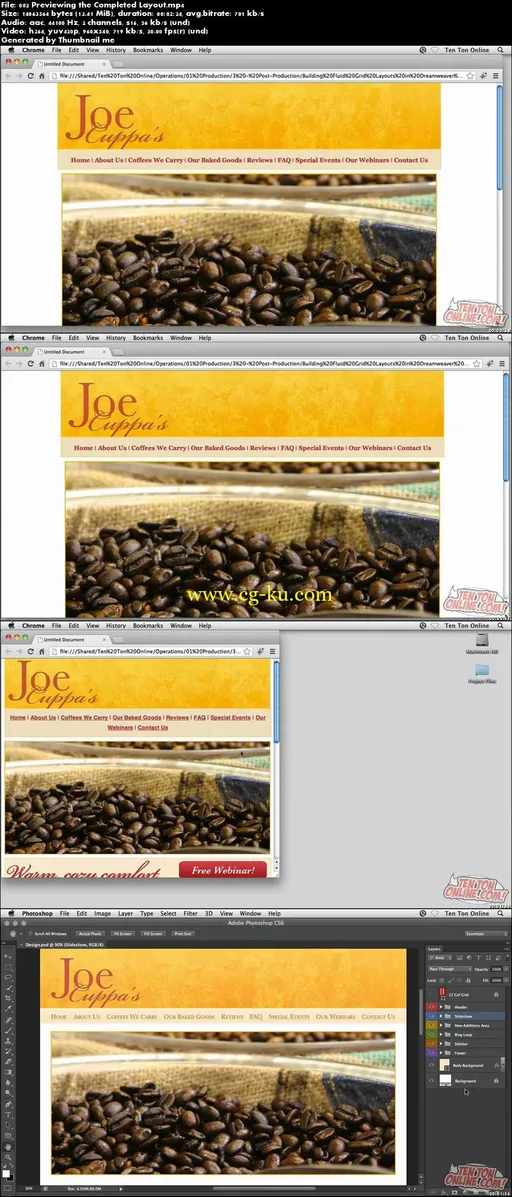
Responsive Design with Dreamweaver CS6
MP4 | Video: 960x540 | 56 kbps | 44 KHz | Duration: 5 Hours | 908 MB
Genre: eLearning | Language: English
Gain clarity and serious responsive design skills!
Learn how to build a website from scratch that’s responsive and flexible by using the fluid grid layout features inside Dreamweaver CS6! This 4+ hour hands-on course, hosted by award-winning software trainer and designer Geoff Blake, will take you step by step through the creation of three different layouts in one HTML document for each type of device used to view the website: mobile, tablet and desktop. First, Geoff will very briefly run you through the basics, getting you comfortable in the Dreamweaver interface. Then, it’s on to building the mobile device network from the ground up by using basic building blocks to insert the logo, header, menu, graphics, text, footer and more! You’ll learn how to adjust the mobile layout to scale, tweaking the design for tablet and desktop devices with the end result being a website that scales depending on whether you’re viewing the mobile, tablet or desktop view.
