Excel 2013 Dashboard Design
MP4 | Video: 1280x720 | 54 kbps | 48 KHz | Duration: 3 Hours | 599 MB
Genre: eLearning | Language: English
Create stunning and fully interactive data visualizations in Excel 2013
Excel 2013 Dashboard Design will show you how to turn your organization’s data into a powerful and interactive dashboard. By learning these easy-to-implement, advanced techniques, you can impress and empower the decision-makers in your organization, making you an irreplaceable asset.
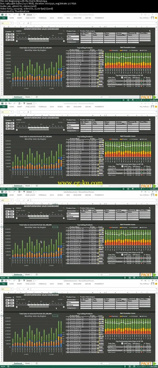
Excel 2013 Dashboard Design begins by creating a vision for the dashboard with the help of stakeholders, and then moves on to gathering the data and building each element of the dashboard. The course ends with comparing distribution strategies appropriate for every size and type of organization.
The first section, Outputs and Inputs, covers the strategic aspects of planning your finished product and bringing in all of the necessary data from your database or Excel workbook. We then explore PowerPivot, a powerful bridge between your raw data and Excel. PivotTables will help us slice our data in a flexible manner, and Charts give us at-a-glance comprehension of important metrics and trends. Stylizing and Interactivity enhance the user experience and present the information in a manageable format. Publication can be problematic without proper planning, but we’ll cover the most effective ways to distribute your dashboard to any type or size of audience.
Excel 2013 Dashboard Design will guide you through your entire project, start to finish, covering every part of the process in depth. Since you’ll not only learn how to do each task, but also why it would be beneficial for you, you’ll be able to easily translate your learning into your own dashboard design project.
