Responsive Design Fundamentals
MOV | AVC 711kbps | English | 960x540 | 30fps | 2h 15mins | AAC stereo 128kbps | 572 MB
Genre: Video Training
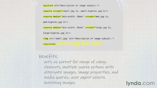
Web projects need to work across multiple devices, screen sizes, and browsing contexts. Web designs need to be responsive to these variables, providing an optimal viewing experience for each scenario. In this course, author James Williamson introduces responsive design to new web designers and fills in any gaps experienced designers may have, while providing a deeper exploration of how current trends in devices, connectivity, and user experience are driving its adoption. The course covers concepts like screen density, fluid grids, and responsive images, as well as actual design strategies that guide you from mock-up to testing.
Introduction 2m 53s
Welcome 1m 8s
Who is this title for? 1m 45s
1. Introducing Responsive Design 14m 16s
What is responsive design? 3m 6s
Exploring the need for responsive design 3m 24s
What makes sites responsive? 2m 37s
Exploring a responsive site 5m 9s
2. Common Concepts 1h 1m
Examining the mobile viewport 4m 12s
Controlling viewports 7m 3s
Understanding screen densities 6m 21s
Designing for multiple screen densities 6m 1s
Understanding media queries 4m 37s
Creating breakpoints with media queries 4m 57s
Using fluid grids 5m 15s
Making images responsive 5m 57s
Examining the future of responsive images 4m 55s
Building responsive forms 6m 47s
Improving site performance 5m 0s
3. Responsive Design Strategies 44m 44s
Designing for the appropriate context 4m 15s
Planning a responsive design 7m 4s
Building responsive mockups 4m 56s
Developing a content strategy for responsive sites 5m 41s
Understanding the mobile context 5m 26s
Designing for mobile capabilities 5m 29s
Creating flexible HTML 6m 1s
Testing responsive designs 5m 52s
Conclusion 12m 3s
Exploring fluid grid frameworks 4m 46s
Looking at responsive design tools 5m 5s
Additional resources 2m 12s


