Creating a Responsive Web Design
MOV | AVC 803kbps | English | 960x600 | 30fps | 1h 31mins | AAC stereo 96kbps | 496 MB
Genre: Video Training
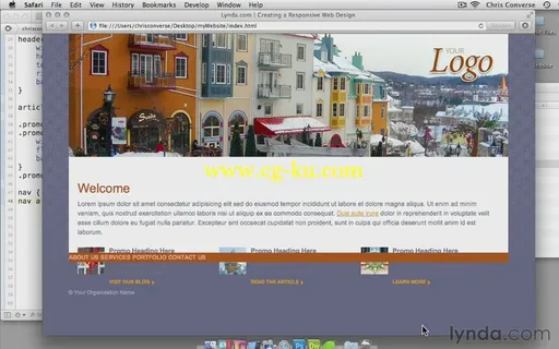
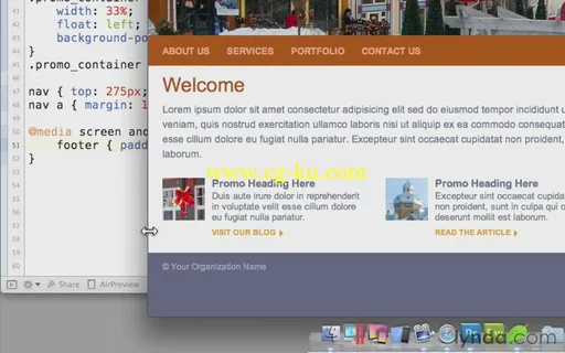
Discover how to make your website more readable and efficient across various screen sizes and devices. Join author Chris Converse as he shares his own specialized techniques for creating a responsive site. The course takes the site from start-to-finish, from comping your ideas in Photoshop, to setting up the HTML page and containers, to styling established elements for small, medium, and large screens. In particular, Chris shows how to load images with CSS, reposition the nav bar for better viewing on mobile devices, and how to make the download time faster for small screens by providing multiple versions of your banner graphic and other images.
Topics include:
Understanding your software needs
Planning your layout
Adding containers, content, and links
Creating and slicing multiple-sized banner images in Photoshop
Linking to CSS files with media queries
Setting the viewport scale
Styling headings, body text, and footers
Styling and repositioning navigation links

