提供了一些极为现代的UI控件,比如Office 2000或OfficeXP 风格的的菜单、工具条、“OfficeXP like Task Panes”和Tabbed Dockable 窗体,在Atlanta上Tech·Ed 2001上曾报道过它。不过最近网站上公布的图片看起来比在以前展示的幻灯片上更加漂亮了。
DevComponents DotNetBar 12.x | 102.3 MB
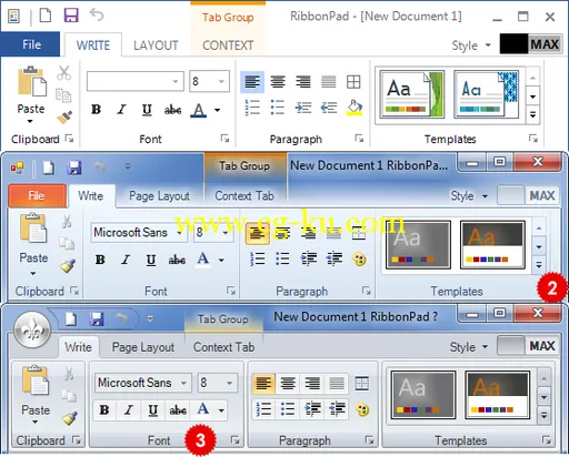
DotNetBar is world's first component to introduce fully featured Office 2013, Office 2010, Windows 7 and Office 2007 style Ribbon controls, first to provide full Windows XP Theme support, first to provide Diamond Docking Guides for dockable windows etc. With DotNetBar you always get latest advancements in user interface technology in your applications before anyone else.
Office 2007 style Ribbon WinForms Control
Fully featured Office 12 like Ribbon Control with KeyTips support, fade animation effects etc.
Office 2007 style SuperTooltips Control
Fully featured Office 12 like Super Tooltips control with 18 color schemes.
Office 2007 style Galleries Control
With built-in scrolling support, popup abilities and automatic resizing.
Office 2007 style Forms
We include two types of Office 2007 style forms: Ribbon Style and Standard.
Office 2007, VS.2005, Office 2003, Office XP and Office 2000 styles
DotNetBar provides multiple styles for menus and toolbars that can be changed on the fly.
Outlook 2003 style Navigation Pane control
Create Navigation Pane user interface with ease.
Dockable Tabbed Windows
DotNetBar also provides the dockable windows for your applications.
Document Docking with split-view technology
Dock windows inside of the client area of the form any way you want.
Auto-Hide Dockable Windows
Use this powerful feature to provide your users with ultimate flexibility and usability when using Dockable Windows.
Tear-Off tabs from Dockable Windows
Your end-users can tear-off tabs from dockable windows or they can dock other dockable windows as a tabs.
Independent Tab Positioning for Dockable Windows
Position Tabs on Dockable Windows on any side of the Bar.
True WYSIWYG docking
DotNetBar Dockable Windows and Bars provide you with true What You See Is What You Get docking functionality. Do not guess where your window will be docked based on hard to see outline, DotNetBar shows in real-time position of your window.
Dockable toolbars
DotNetBar toolbars are dockable and you have full control where they can be docked or whether they can be undocked.
Windows XP Themes Support
DotNetBar fully support Windows XP Themes. This means that your user interface will always have the latest visual styles provided by Windows XP.
Popup menu and popup toolbars
Create popup menus or toolbars simply by setting the PopupType property on your items.
Windows XP style Explorer-bar control
Since release 2.0 of DotNetBar suite Windows XP Explorer-bar control with full Windows XP Theme support and new Style interface is available.
Flat style Side-bar control
Includes 18 predefined color schemes.
Outlook style Side-bar control
Included with DotNetBar is Outlook style side-bar control with same easy-to-use interface and complete Windows XP Theme support.
Windows XP style Balloon control
Convey important bits of information to your users easily with Balloon control.
Popup container that lets you popup any Windows Forms Control
You can popup any control from toolbar or menu item. See Notepad sample color selector for great example of this feature.
Host any Windows Forms Control on menu or toolbar
ControlContainerItem will let you host any Windows Forms Control on menu or toolbar.
Context menus for all your controls
DotNetBar provides the extender property to all your controls that allows you to set the context menus with one mouse-click.
Create Office XP like Task Panes
Use TaskList layout type to create Office XP like task panes.
Support for up to three different image sizes on toolbars using ImageList
With release of Windows XP the user interface guidelines have been changed and up to three different image sizes are recommended for toolbars.
Color Scheme Support
DotNetBar Color Scheme model lets you change and customize the color of almost every visible part of DotNetBar menus and toolbars.
Image container
You can store item images directly in DotNetBar which eliminate the need to use ImageList control and simplifies the management of your menus and toolbars since everything is in one place.
Animated menus
Create menus that can slide, open, unfold or fade. DotNetBar provides great flexibility on how these effects are used: use system default settings, set control wide effects or set them for each item.
Personalized Menus
Reduces the menu complexity by hiding unused menu items.
Save and Restore Layout and usage data
Save and restore complete DotNetBar configuration and usage data in XML based format at run-time or design time.
Automatic Image Processing
DotNetBar automatically creates disabled or grayed images from the basic image you provide.
End-Users Customization of Menus and Toolbars
DotNetBar lets your end-users customize both menus and toolbars at run-time. You are in full control so you can disable this feature or disabled it only for particular items.
Extensible framework
You can create your own items and that way extended DotNetBar functionality.
Multi-functional Panel control
Included with DotNetBar is multi-functional panel control with color scheme support, gradient background colors, background images and mouse state support.
TabStrip control with 9 different styles
TabStrip control on steroids includes automatic MDI child form management feature.
Real Tab Control with 9 different styles
Container tab control with multi-line tab support and much more.
BubbleBar control you can find only in DotNetBar
Distinguish your applications with this unique toolbar control.
Expandable Splitter control
Manage sparse screen real estate with powerful simple to use expandable splitter control.
What's new in DotNetBar 12.1.0.0:
- The new/initial release version of DevComponents DotNetBar.
- May include unspecified updates, enhancements, or bug fixes.