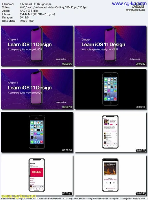
MP4 | Video: h264, 1920x1080 | Audio: AAC, 44.1 KHz, 2 Ch
Genre: eLearning | Language: English | Duration: 9 Lessons (2h 3m) | Size: 753.91 MB
A complete guide to designing for iOS 11
While flat design has become universal over the past 5 years, it wasn’t so common before iOS 7. It was the shift that shaped the design landscape. But to say that it hasn’t evolved would be inaccurate. iOS design has adapted to the bigger screens. What started as the ultimate opposite of hyper realistic designs that preceded it, flat design is now much more nuanced, giving way to gradients, drop shadows and cards.
The Evolution of iOS
Let’s start from the beginning and look at the image below. On the left, a hyper realistic design, also known as Skeuomorphic. It was effective to introduce strong metaphors because in 2007, few were familiar with having a super computer in your pocket. In the middle, we got rid of all ornaments in favor of flat colors, beautiful typography and high-resolution content. Since most of us got increasingly comfortable with technology, it was no longer necessary to adorn our designs with heavy decorations. On the right, a screen from iOS 11. Titles are much bolder, and as a result more readable. Because of the taller screens, it is now much more common to see the bottom navigation (known as Tab bar). Designers today have to adapt their layouts against multiple resolutions and pixel densities. The good news is that we have better tools, like Sketch and Xcode, to prepare us for these modern techniques.


发布日期: 2020-08-13