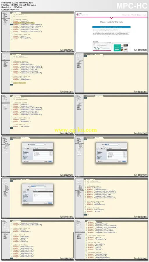
Lynda - Building a Responsive Single-Page Design | 987MB
Duration: 4h 58m | Video: AVC (.mp4) 1280x720 15&30fps | Audio: AAC 48KHz 2ch
Genre: eLearning | Level: Intermediate | Language: English
Learn how to build dynamic, responsive single-page designs with HTML, JavaScript, and CSS. The website featured in this course combines docking navigation, columns that adjust without cluttering your site layout or HTML markup, and animated scrolling effects that respond to user direction. Author Ray Villalobos shows you how to build it. He starts with a lean, easy-to-read template, and then explains how to add the features that make single-page designs so great, with these four frameworks:
* Compass, whose Sass mixins help you leverage CSS3 features like Flexbox
* Susy 2, the framework that "subtracts" the math from responsive grid design
* ScrollMagic, for adding "magical" scroll effects
* Breakpoint, which makes writing media queries in Sass a snap
But this course isn't just about the tools. It's a realistic project that epitomizes many of the design challenges website developers face in the real world. Start watching now and learn how to use HTML, jQuery, and CSS to build your own dynamic, deeply responsive designs.
Topics include:
* Analyzing the project before you begin
* Creating basic styles
* Building your own Sass mixins
* Coding the navigation
* Making the navigation responsive, with grids
* Using a split layout
* Creating tween animations
* Controlling scenes with scrolling

发布日期: 2014-09-24