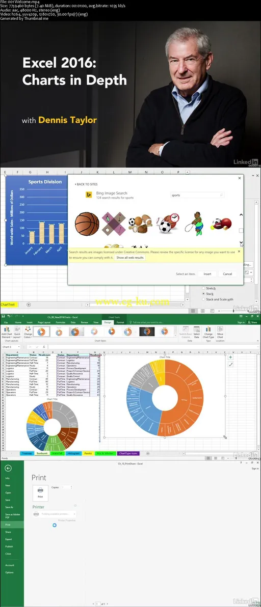
Excel 2016: Charts in Depth
MP4 | Video: AVC 1280x720 | Audio: AAC 48KHz 2ch | Duration: 4Hr 33Min | 810 MB
Genre: eLearning | Language: English
Charts allow you to communicate information visually, in a way that's more impactful than raw data, and they happen to be one of the most powerful and easy-to-use features in Microsoft Excel. In Excel 2016, there are six brand-new chart types to learn. Let Dennis Taylor show you how to create different kinds of Excel charts, from column, bar, and line charts to exploded pies, and decide which type works best for your data. Learn how to fine-tune your chart's color and style; add titles, labels, and legends; insert shapes, pictures, and text boxes; and pull data from multiple sources. Plus, get an overview of the new chart types in Excel 2016: Treemap, Sunburst, Waterfall, Histogram, Pareto, and Box & Whisker.
The training wraps up with lesson on changing data sources for charts and printing and sharing charts.
Topics include:
Identifying chart elements
Selecting the right chart type
Creating basic charts
Creating sparklines
Styling charts
Moving and resizing charts
Modifying axes
Adding labels and gridlines
Analyzing data with trendlines
Inserting pictures, shapes, and text boxes
Customizing column, bar, line, and pie charts
Creating Gantt charts and other specialized Excel charts
Changing data sources
Printing and sharing charts

发布日期: 2016-02-18