CG数据库 >> Responsive Design: Patterns & Principles-P2P
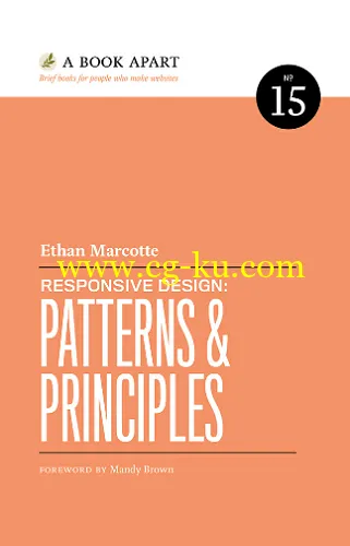
As responsive design evolves, we have a critical need to think about design challenges beyond mobile, tablet, and desktop. When properly designed and planned, design patterns-small, reusable modules-help your responsive layout reach more devices (and people) than ever before. Ethan Marcotte shows you just how that’s done, focusing on responsive navigation systems, resizing and adapting images, managing advertising in a responsive context, and broader principles for designing more flexible, device-independent layouts.

Responsive Design: Patterns & Principles-P2P
English | 2015 | ISBN: 1937557332 | 160 pages | ePUB | 117.15 MB
发布日期: 2016-11-02