Responsive CSS with Sass and Compass | 428 MB
duration : 3h 31m | Video: AVC (.mp4) 960x540 15fps | Audio: AAC 48KHz 1ch
Genre: eLearning | Level: Intermediate | Language: English | released : Oct 30, 2013
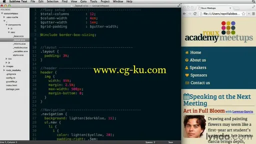
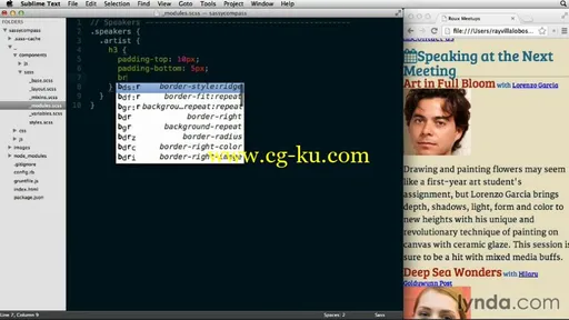
Using a framework helps simplify your workflow and makes writing CSS fun again. Learn how Compass (powered by Sass) can help you build responsive layouts that are easier, faster, and more compatible than using CSS alone. In this course, Ray Villalobos shows how to automate your workflow with Grunt.js, scaffold your HTML, modularize your Sass with partials, and get started styling with variables and mixins. Plus, learn how to create a mobile-first grid with Susy—without adding nonsemantic HTML markup.
Need a refresher on Sass? Check out CSS with LESS and Sass with Joe Marini.
Topics include:
What are Sass and Compass?
Adding version control
Setting up a workflow with Grunt.js
Modularizing your Sass with partials
Creating a color palette with variables
Using Compass mixins
Creating a mobile-first layout
Creating media-query breakpoints with Susy
Designing a responsive grid with Susy


发布日期: 2013-11-06