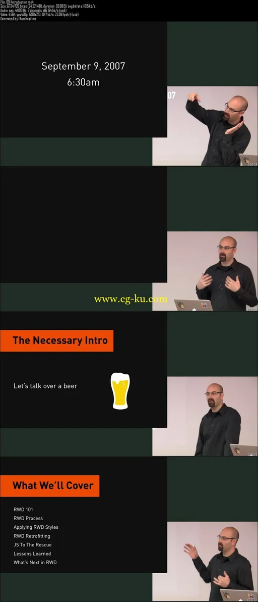
Build Responsively: How to Create Responsive Websites
MP4 | Video: AVC 1280x720 | Audio: AAC 44KHz 2ch | Duration: 5 Hours | 1.61 GB
Genre: eLearning | Language: English
Learn everything you need to know about customized responsive website designs that will display perfectly on all devices
With the rise of mobile devices, the web is no longer a fixed width, and this is why website designers and web developers need to know how to implement responsive design into every project.
Users today aren't only viewing sites on their computers; they're also on their tablets, smartphones, and even their HDTVs.
This course will teach you how to build a site that will automatically respond to the many different size and display options out there so you can rest assured it will always appear just as you intended.
Easily Implement Responsive Design into Each and Every Website Project
Master the RWD Process, including Content Priority and Style Prototypes
Learn How to Easily Apply RWD Styles
Retrofit Old Websites to Make Them Responsive
Test Responsive Websites for Consistency Across Devices
Build Attractive Websites That are Optimized for Viewing on All Devices
This comprehensive course is designed to teach you how to build an attractive, user-friendly website for the 21st century.
Regardless of your experience with responsive design, this course will guide you in how to implement responsive tools and techniques into your current workflow.
Some of the topics that you'll tackle include the RWD process, responsive CSS, prototyping, patterns, and coding tactics that involve media queries.
Contents and Overview
This course begins with an introduction to responsive website design. You'll understand about why it's so important to build responsive websites before tackling the importance of IE rounding and the semantic grid design for creating consistent and fluid designs.
Next, you'll learn how to add responsive CSS to website elements, such as images, as well as how to add or override CSS with media queries.
When ready, you'll move into the RWD process and understand how to use content priority and style prototypes.
You'll also learn how to apply RWD styles, from the basic structure of a site to CSS files. You'll utilize EM-based media queries, as well as work with navigation, tables, images, and off-canvas layouts.
Then you'll master retrofitting to make existing websites responsive. You'll know how to retrofit images, tables, media queries, and more.
Finally, you'll tackle how to prioritize content and functionality, test websites on real devices, price your responsive website projects, and much more.
By the end of this course, you'll know everything you need to create responsive websites so you can build sites that are perfectly suited for display on a wide range of modern devices.

发布日期: 2017-04-08