Effective Data Visualization
MP4 | Video: AVC 1280x720 | Audio: AAC 44KHz 2ch | Duration: 3 Hours | Lec: 12 | 514 MB
Genre: eLearning | Language: English
Through design principles drawn from graphic design, visual art, perceptual psychology, and cognitive science
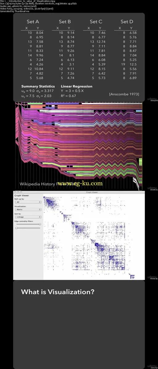
Learn the methods you need to bring data to life through effective visualizations. In this video course, host Jefrey Heer—co-founder of Trifacta—takes you through best practices for designing interactive visualizations, performing exploratory data analysis, and examining multidimensional data.
You’ll begin by learning the value of visualization, through design principles drawn from graphic design, visual art, perceptual psychology, and cognitive science. Using Trifacta’s data transformation tools to illustrate some of the concepts, you’ll also learn techniques for scaling visualizations to extremely large data sets.
In two parts—Effective Visualization Design and Visualizing Big Data—this course will teach you practical tips on topics including:
Visualization design fundamentals: data and image models, graphical perception, and color design
Visual data analysis and exploration: exploratory data analysis, multidimensional data, interaction techniques
Data reduction strategies: sampling, aggregation, and model fitting
Effective visualization of big data: scalable visual encoding methods and interaction techniques
Jefrey Heer is a co-founder and CXO (Chief Experience Officer) at Trifacta Inc. He spent many years as a professor of Computer Science at Stanford University, where he led the Stanford Visualization Group. His group created several popular tools, including D3.js (Data-Driven Documents) and Data Wrangler. Jeff is currently a faculty member of Computer Science & Engineering at the University of Washington.

发布日期: 2017-04-15