Hands-on Responsive Web Design 1: Media Queries & CSS Preprocessing
MP4 | Video: AVC 1280x720 | Audio: AAC 44KHz 2ch | Duration: 1 Hours 47M | 394 MB
Genre: eLearning | Language: English
Responsive, mobile first web design is a skill required for web developer's in today's mobile world. This course will teach you how to build a responsive template using SASS and a CSS preprocessor that you'll use in your next web development…
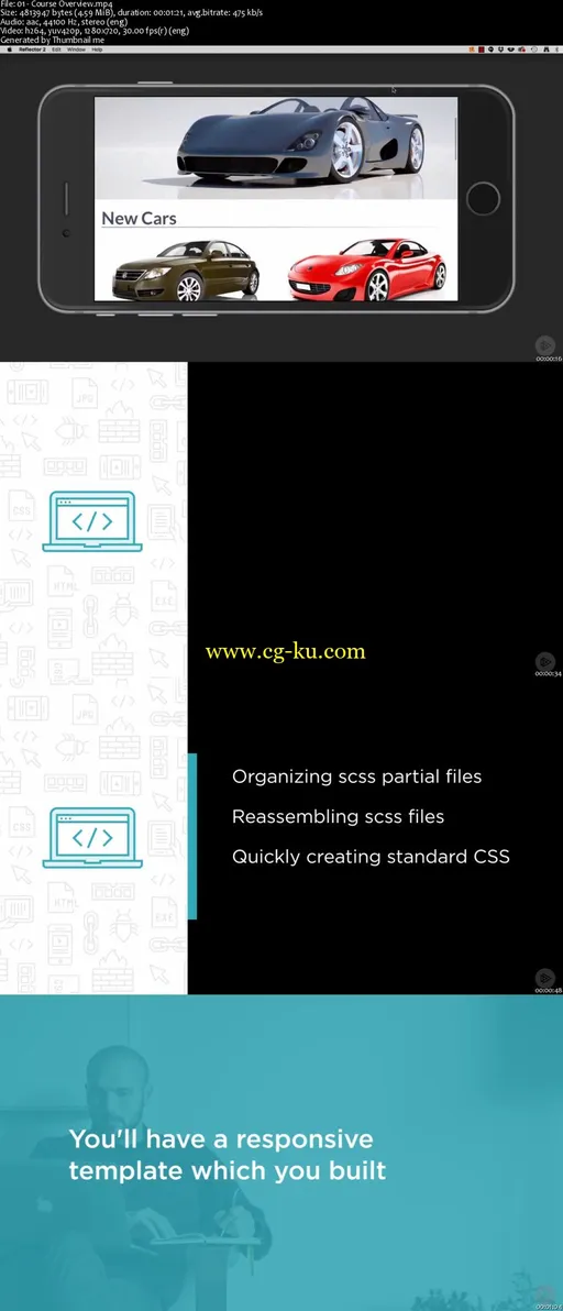
At the heart of developing any responsive website is a thorough knowledge of how to use HTML5, CSS3, and SASS. In this course, Responsive Web Design 1: Media Queries and CSS Preprocessing, you'll learn the skills you need to create a mobile first, responsive web page template that can be used as a basis for an entire site or even a CMS. First, you'll learn the appropriate way to organize your SCSS partial files and how to reassemble them while including media queries. Next, you'll discover how to use variables and math operations to quickly create standard CSS. Finally, you'll cover html semantics and way-finding so that your websites are attractive as well as functional. When you're finished with this course, you'll have built a responsive template, which is ready to be used as you create your own personal or commercial websites. Software required: Brackets.

发布日期: 2017-06-08