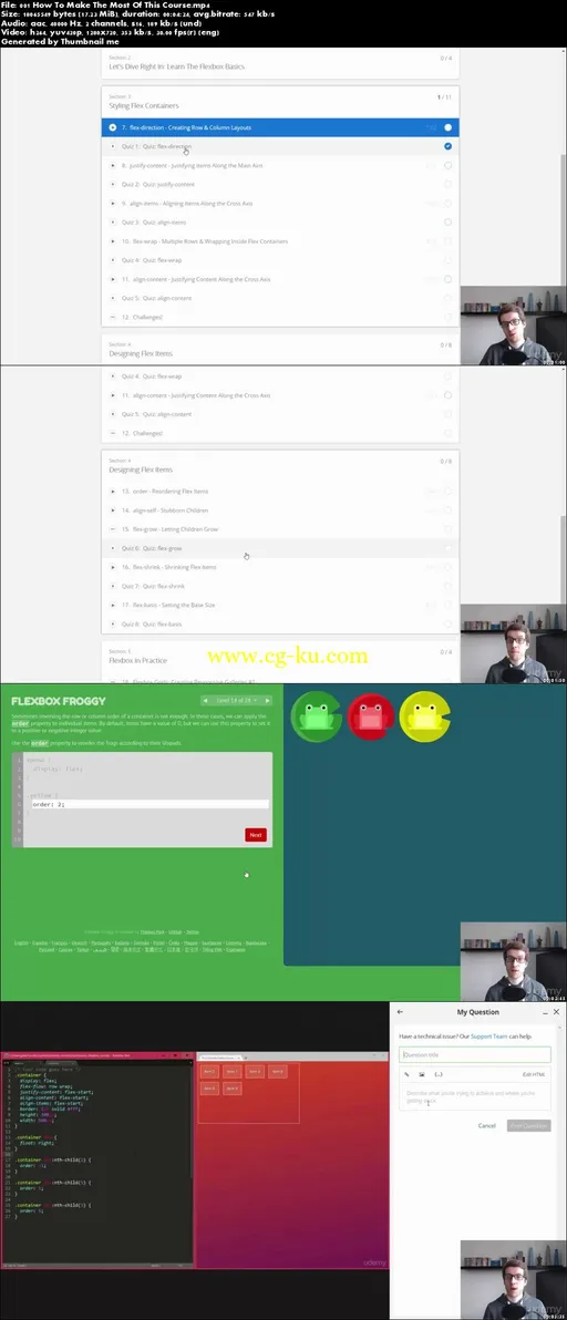
The Complete Flexbox Tutorial: Learn CSS3 Flexbox in 2017
MP4 | Video: AVC 1280x720 | Audio: AAC 44KHz 2ch | Duration: 2 Hours | Lec: 23 | 313 MB
Genre: eLearning | Language: English
This tutorial teaches you how to use the new CSS3 Flexbox box model to create responsive web layouts more effectively!
After this course, you'll be able to use Flexbox to…
vertically align any element
create modern grids
take up remaining space
add spacing between elements
implement complete site layouts
and much more!
Inside the course, I'll answer all questions you may have along the way.
To see Flexbox in practice, 3 mini-projects will manifest your skills and enable you to use Flexbox productively in future web design projects.
In this tutorial, you'll learn to use each and every Flexbox property:
Styling flex containers:
flex-direction
justify-content
align-items
flex-wrap
align-content
Then individual flex items:
order
align-self
flex-grow
flex-shrink
flex-basis
flex
At the end, we'll look at real-world Flexbox examples to see what kinds of layouts can be achieved:
Simple grids with Flexbox where all columns in a row have the same size
More advanced Flexbox grids where columns can have arbitrary sizes
Vertical centering to vertically align any element
Media objects, the popular OOCSS pattern
The Holy Grail Layout, a complete site layout with sidebars and sticky footer
As a bonus, this course includes a complete Flexbox Cheat Sheet that you can use to recap all you've learned and to refer back to while using Flexbox.
Additionally, I included the code for a Flexbox demo showcase – which is like an interactive cheat sheet for you to see in the browser that contains every property and every layout example from this tutorial.

发布日期: 2017-08-24