Hands-on Responsive Web Design 2: Responsive Images and Sliders
MP4 | Video: AVC 1280x720 | Audio: AAC 44KHz 2ch | Duration: 2 Hours | 661 MB
Genre: eLearning | Language: English
When developing any responsive website, typically you know the ins and outs of HTML5, CSS3, and SASS. This course teaches you how to implement responsive images using both image and picture tags that you can use in your next web development project.
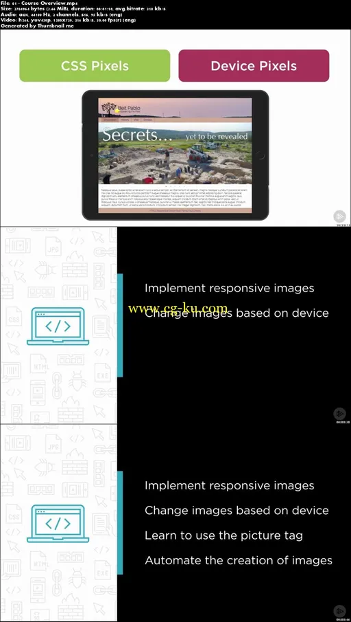
At the heart of developing any responsive website is a thorough knowledge of how to use HTML5, CSS3, and SASS. In this course, Hands-on Responsive Web Design 2: Responsive Images and Sliders, you'll learn the skills you need to implement responsive images using source set (srcset), and change images based on device pixel density and image width. First, you'll explore how to use the picture tag to target images based on media queries. Next, you'll dive into how to automate the creation of multiple sized images using Photoshop. Finally, you'll discover under what circumstances you should implement them. When you're finished with this course, you'll have built several functioning examples, which you can use in your next project. Software required: Brackets, Koala.app, and Photoshop.

发布日期: 2017-08-26