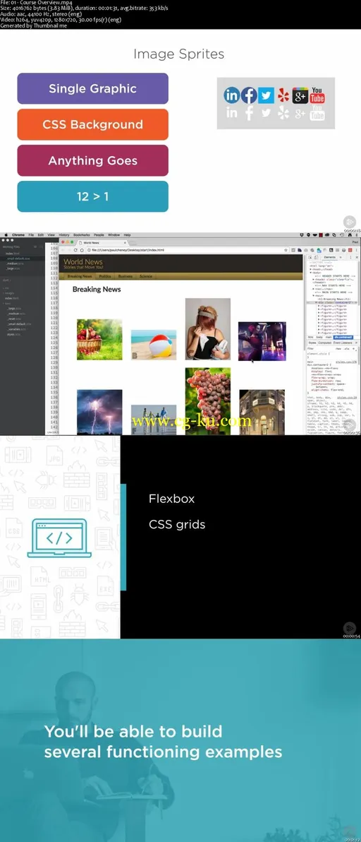
Hands-on Responsive Web Design 3: Columns, Flexbox, and GridsMP4 | Video: AVC 1280x720 | Audio: AAC 44KHz 2ch | Duration: 2 Hours | 440 MBGenre: eLearning | Language: EnglishThis course will teach you how to implement multiple column layouts using standard divisions, Flexbox, and CSS Grids.
You'll also examine CSS shapes for interesting text wrapping.
At the heart of developing any responsive website is a thorough knowledge of how to use HTML5, CSS3, and SASS.
In this course, Hands-on Responsive Web Design 3: Columns, Flexbox, and Grids, you'll learn the skills you need to layout a page using standard divisions and CSS, as well as newer technologies like Flexbox and CSS Grids.
First, you'll discover how to automate this process by leveraging the power of SASS operators.
Next, you'll explore how to use CSS shapes to create text wrapping.
Finally, you'll delve into using CSS Grids for the overall page layout.
By the end of this course, you'll have a mobile music player app project that adapts to vertical or horizontal orientation of mobile screens.


发布日期: 2017-11-16