MP4 | Video: h264, 1280x720 | Audio: AAC, 48 KHz, 2 Ch
Genre: eLearning | Language: English + .VTT | Duration: 5 hours | Size: 3.78 GB
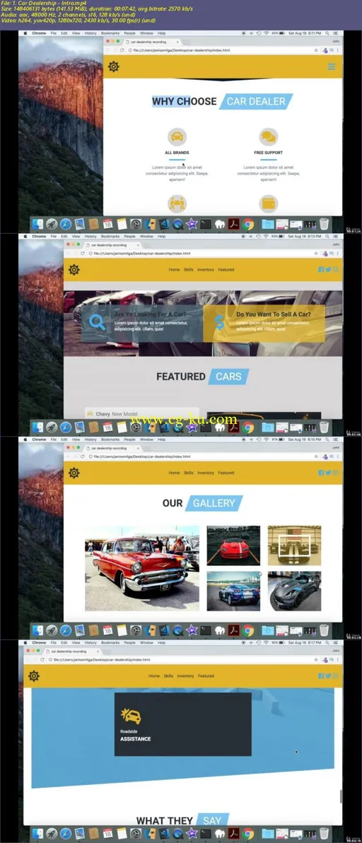
In this course we will create Create Responsive Car Dealership Website from SCRATCH
During the course you will work with
- HTML5 to setup the structure for the webiste
- Bootstrap 4 to add elements to the website
- CSS3 to style the website
- Javascript to add functionality for the website
We will create website from scratch without any third party libraries or plugins.
During the course we will explore
- Where to download google custom fonts
- Choose the colors for the website
- Download free stock images
- Download free stock video
- Download free stock loading images
- Download free icons for the website.
- How to work with @media queries
We will start a course by creating a navbar with logo, links and social media icons. The navbar will be responsive so on the smaller screen size the links and social icons will not be displayed and navbar toggler button will be displayed instead. As the user clicks the navbar toggler button the links will be displayed.Next we will create a header section with a background image and title on the left hand side. We will animation to the header so every 20 seconds the image will zoom in and move to the left. We will also work with a clip-path property to create a custom shape for our header section. After that we will create a skills section with four columns and section title. Next we will build a inventory section were all the cars will be displayed.Each car will have a bootstrap-card and inventory data will be added dynamically using javascript. Following we will make question section with background images and two column layout and font-awesome icons. After that we will create featured section, with special cars in one column and image of each car in other column.We will use javascript to select and add special cars to the list, as well as showing the image of the car as the car-icon is clicked. Following featured section we will make gallery section where we will learn how to work with nested columns in bootstrap. We will ad a hover effect to each image with css and create modal and display each picture in the modal with javascript. The contact section with two form will be next and services section will be right after that. The services section will have video background with colored overlay and three service items position on top of video. Again we will create a custom shape for the section using clip path. The last two section we will be making will be reviews and footer section. In the review section we will make three cards, with car images and customer images. At the very end we will ad a custom class to navbar if the user scrolls below the height of the navbar.
Who is the target audience?
Anyone who wants to build responsive websites with Bootsrtap 4
Requirements
Text Editor
Web Browser
Knowledge of HTML5
Knowledge of CSS3
Knowledge of Bootstrap 4
Knowledge of Javascript

Password/解压密码
-0daydown
发布日期: 2018-08-22